Prior to publishing any changes to your site, please submit screenshots or a link to your development site for review.
Banner and logo
Our preferred banner and logo combination for external systems is a white logo on a blue background (as per this template). The full colour logo can be used against a white background if the site is unable to incorporate the blue banner.
You should use the SVG version of the logo where possible. JPG and PNG versions are also available below. Note, assets must be hosted on the external site. Please do not hotlink from the North Yorkshire Council website.
White logo with transparent background
SVG

PNG

Full colour logo
SVG

PNG

JPG

Logo padding
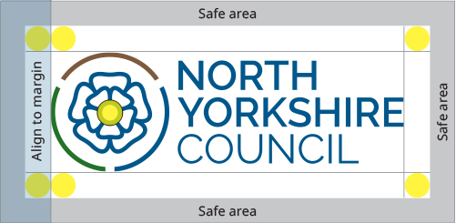
A space the size of the centre rose section is to be left around the logo, this creates breathing space for the logo and maintains a clear and concise identity. If the exact measurement is not possible within the parameters of the platform, then a suitable area must still be left around the logo.
Logo resizing
You must retain the aspect ratio of the logo if it needs to be resized. Do not reproduce the logo in any other colours and do not add any additional wording.
Logo destination URL
The logo should direct users to the homepage of the external system. A link in the footer will allow users to navigate back to our public website.
Font
Google Open Sans is our chosen font for websites.
Headings
Write all headings in sentence case. The sizing should be set as follows:
H2 font-size 36px
H3 font-size 24px
H4 font-size 19px
Paragraph text
The font size for standard paragraph text is 17px.
Hyperlinks
When writing a link, make it descriptive and front-load it with relevant terms instead of using something generic like ‘click here’ or ‘more’. Generic links do not make sense out of context or tell users where a link will take them. They also do not work for people using screen readers, who often scan through a list of links to navigate a page. It’s important the links are descriptive so they make sense in isolation. Find more information about links on GOV.UK.
Corporate colours
Principal colours are blue, green and brown (water, countryside and heritage).
Water
#005489
Countryside
#347121
Heritage
#866243
Footer
Footer logo
SVG

PNG

JPG

Footer links
Footer links eg. accessibility and cookies, should direct users to the corresponding page of the North Yorkshire Council website unless you house this information on your own site.
Accessibility
Ensure the site conforms to WCAG 2.1 level AA. If the site does not meet these standards, you must publish an accessibility statement which details areas of non-compliance. View GOV.UK for further information on accessibility.
The following colours should be used for focus states ie. to indicate which element is focused on. Keyboard tab to the elements within this template for examples.
Responsive design
This template is built using the Bootstrap frontend toolkit. Sites may use a different framework but the responsive design of each element should remain the same.
GOV.UK Design System
Our styles, components and patterns are closely linked to the GOV.UK Design System, which ensures our services are consistent and based upon research. Please ensure you follow the design system where possible.
Further branding information
You can request our branding guide for detailed information about our brand.
